
I need to make a sample for a new pattern. It's written, the design is featured in Northcott's Winter 2022 look book and it needs a cover quilt. Unfortunately, the fabric I designed it with will not be available for several months.
 |
| Shiny Blossoms mocked up in Northcott's upcoming Dragonfly Dreams fabrics |
Since I designed it with a light background, I thought it would be an interesting exercise to make the sample with a darker background. I spent a couple of hours browsing the aisles of my local quit shop and came up with two possibilities.
Sometimes I can see clearly in my head what the quilt will look like in certain fabrics. This time the picture stayed fuzzy. None of the fabric combinations I pulled together made me excited to take it home. Still, I needed fabric for the test sample so I ended up buying a little bit of each combo to make sample blocks. I felt sure I'd know what to pick once I had blocks sewn.
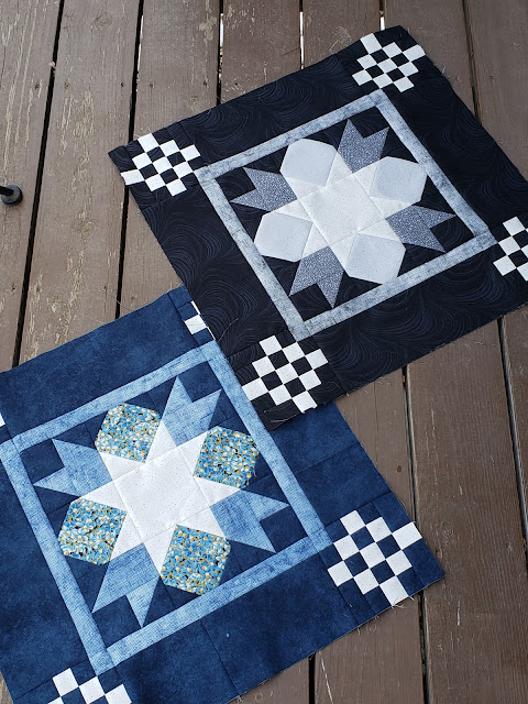
Nope. I still don't know.
The center star and the checkerboard cornerstones in both blocks are actually the same light yellow with little speckles. The photo really washes out its colour and doesn't do it justice, but it's really quite pretty.
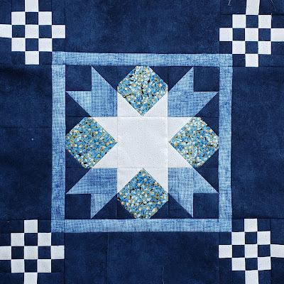
I love blues, so I was surprised when the blue version didn't immediately speak to me. I think the blue floral might be what's holding me back. I though a print would add interest and that the little yellow accents in the floral would go well with the yellow in the star, but I'm not sure this print fits with the rest of the fabrics. Also, my eye is drawn to the central star rather than to the whole block.
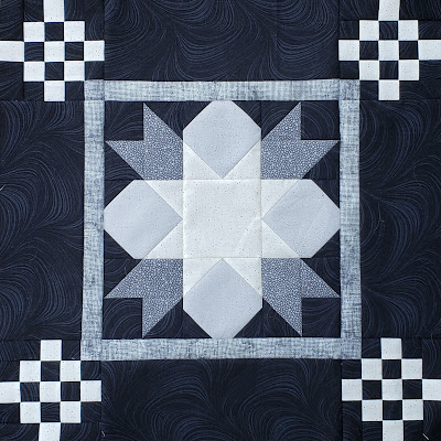
I really love the texture in the black background, and I feel the greys I chose emphasize the blossom shape more than the star. To my surprise, this block actually appeals to me a little bit more than the blue one. I'm just not sure I want a whole quilt of these fabrics. I'm also worried all that black without brighter colors will not appeal to customers if I use this quilt on the pattern cover.
One option would be to go ahead and make the black version to test the pattern, but use the Dragonfly Dreams mock-up on the cover. I'm not excited about that though. I like to have a finished quilt on the pattern cover to show consumers that it's possible to make the quilt. The few patterns I released with a mock-up on a cover (because I had difficulty getting a good photo) don't sell well. Then again, maybe that's just a coincidence. I have a few patterns I was excited about that have an actual finished quilt on the cover yet don't sell well at all, so maybe real quilt vs mockup wasn't the issue.
Another option is to go back to the shop and try to pull together another fabric combination.
What would you do? Ideas are welcome!
They are all beautiful but they each have a different look. Would it be possible to make pillows out of the other two on the pattern to show the diversity of the pattern? Having said that..... I think I prefer the black. The star is muted because there isn't as much contrast but I like it like that. I think what you aren't liking about the blue one is the stark contrast that is has with the other colors. I don't really think it would help to buy more fabric. Then you will just have more choices! LOL I am anxious to see what you decide.
ReplyDeleteI, too, like the black/grey version better, but also would hesitate to make a whole quilt with those colors of that pattern. The blues are nice, and while I can't see the yellow (I hate when photos do that!), I think maybe the print would have done better as the star - make it thr focus there, but swap its place with the yellow? Another idea I had was to use the pinks (well, a substitute...) and reverse the colors there. You could use the actual quilt on the cover with the mockup inserted in the corner? But maybe not... Maybe combine the blacks and blues and use the blacks for background and blues for the other block parts (maybe not the floral for this one)? Whatever you choose, I'm sure it will turn out well - and only those of us who see this post will know what they're missing out on!
ReplyDeletePersonally, I prefer the blue one. The star with the blue/yellow print is prettier than the other one. It does look like a flower with a star at its heart. The light grey fabric make the star disappear in the black block. To me, anyway, it looks like a cross. Sorry for saying, but that my honest opinion. Good luck with the decision. ;^)
ReplyDeleteI really like it in the blues, but I think you might be right that it is the blue floral. Plus I thought it was white instead of a light yellow.
ReplyDeleteI agree with you about the blue block. Could you put an inset black/gray full quilt photo on the cover as well as the pink mockup? I've seen that on other covers. I do like this pattern.
ReplyDeleteI too am crazy for blues and I like yours. I really like the black, gray and white most though. Go figure!
ReplyDeleteI prefer the blue version. The 3 fabrics in the middle portion don't blend together as much as in the black one.
ReplyDeleteIf you're planning to keep the quilt yourself, you could look at your other quilts, and if you already have loads of blue ones, it might make a nice change to have a black and grey one.
As a last resort I might make the decision based on fabric cost, if I really couldn't choose, but one version used slightly less expensive fabrics, I'd go for that one.
When I enlarged the last photo it really came across as blue, but I’m not getting the yellow in the little cornerstones either, so it could be the way the color is displaying on the monitor. Did you make a decision yet?
ReplyDeleteI think the black looks more sophisticated, but I would probably want more contrast in the center. However, it sounds like you don't want the star to stand out as much as the blue one does. I actually like the star in the blue one. :)
ReplyDeleteThey look all very good, my preference would be the black/grey version. For me it have a more modern feel which I would prefer.
ReplyDelete